FreshBooks design system
Product designer
The team moved to Figma but lacked a complete design system, leading to ad hoc components and inconsistent UX. The goal was to build a comprehensive system to speed up workflows, improve communication, and ensure consistency.
The assessment
As part of the core team focused on UX and accessibility, we assessed the entire system and uncovered inconsistencies across the main product, mobile app, and website—each using different component libraries. This highlighted the need for a unified, cohesive structure.
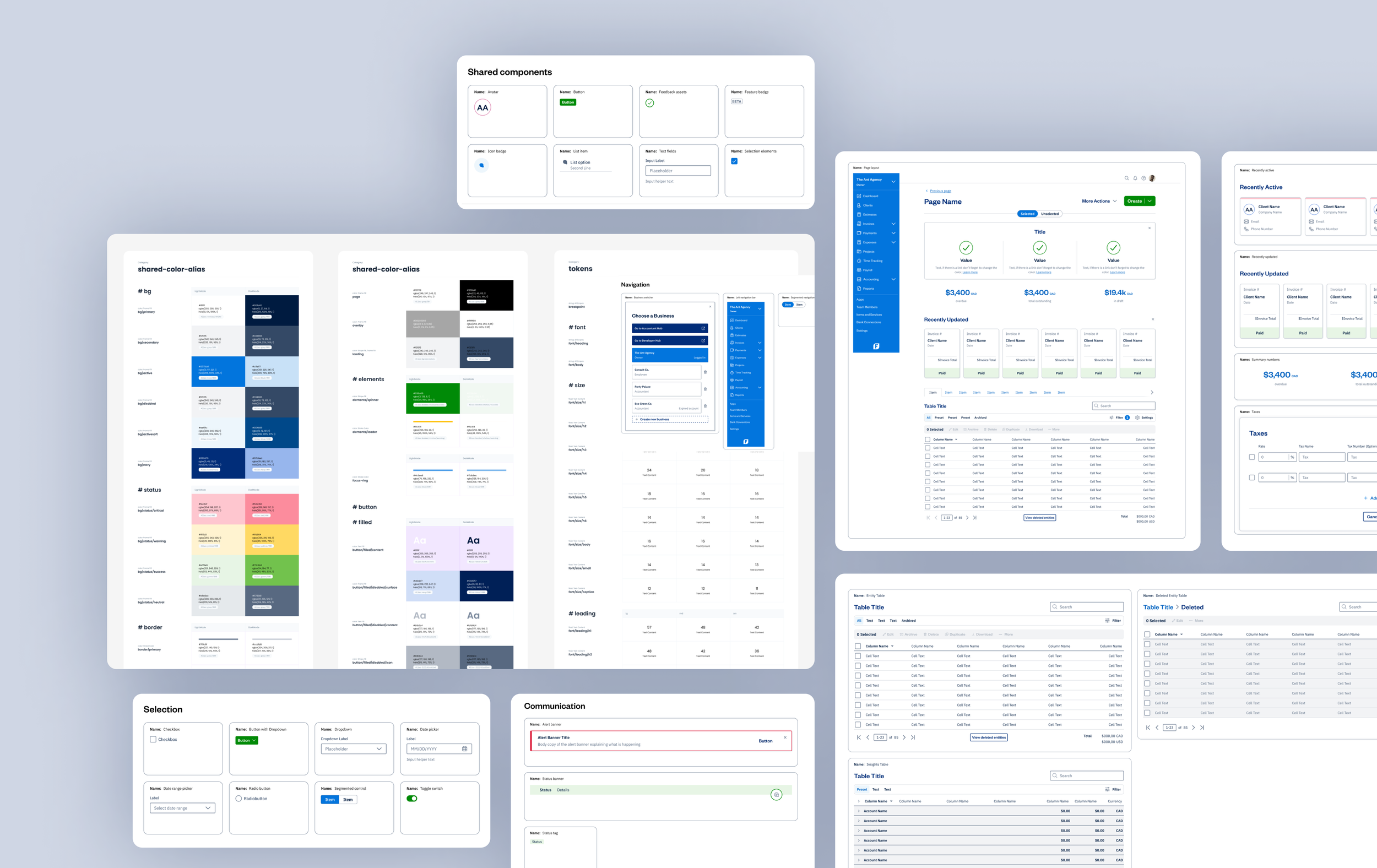
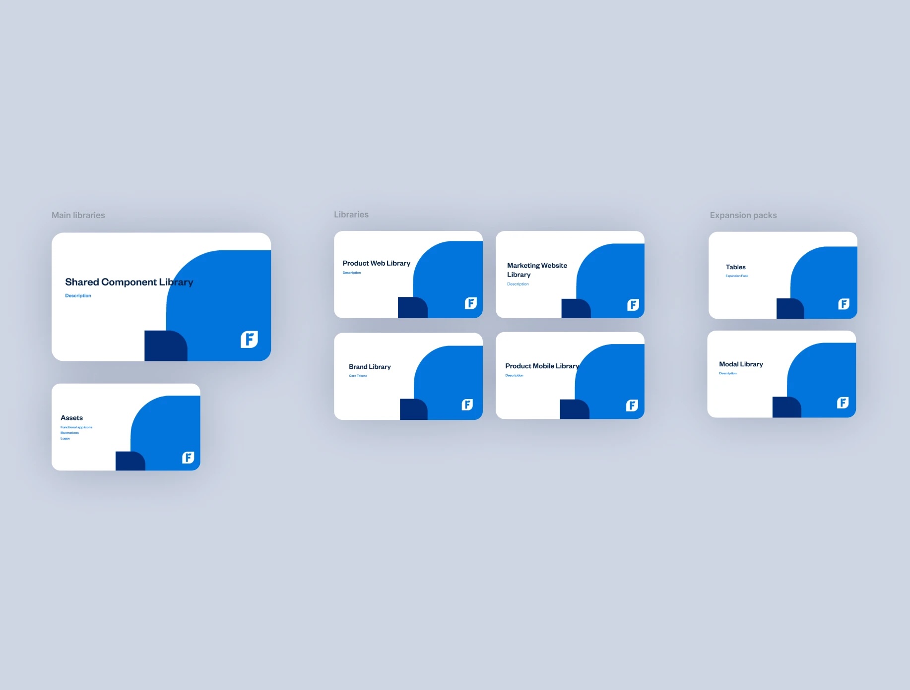
The system architecture
We created a Shared Component Library as the core resource, with dedicated extensions for each product (Web, Mobile, Marketing, etc.).
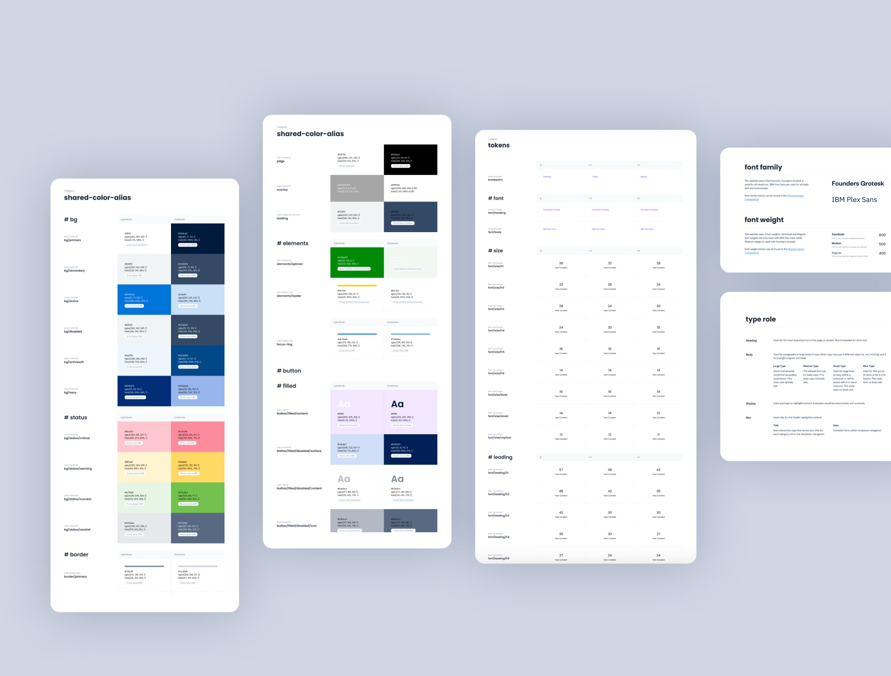
Each library has three levels:
- Tokens: Colors, typography, grids, icons, etc.
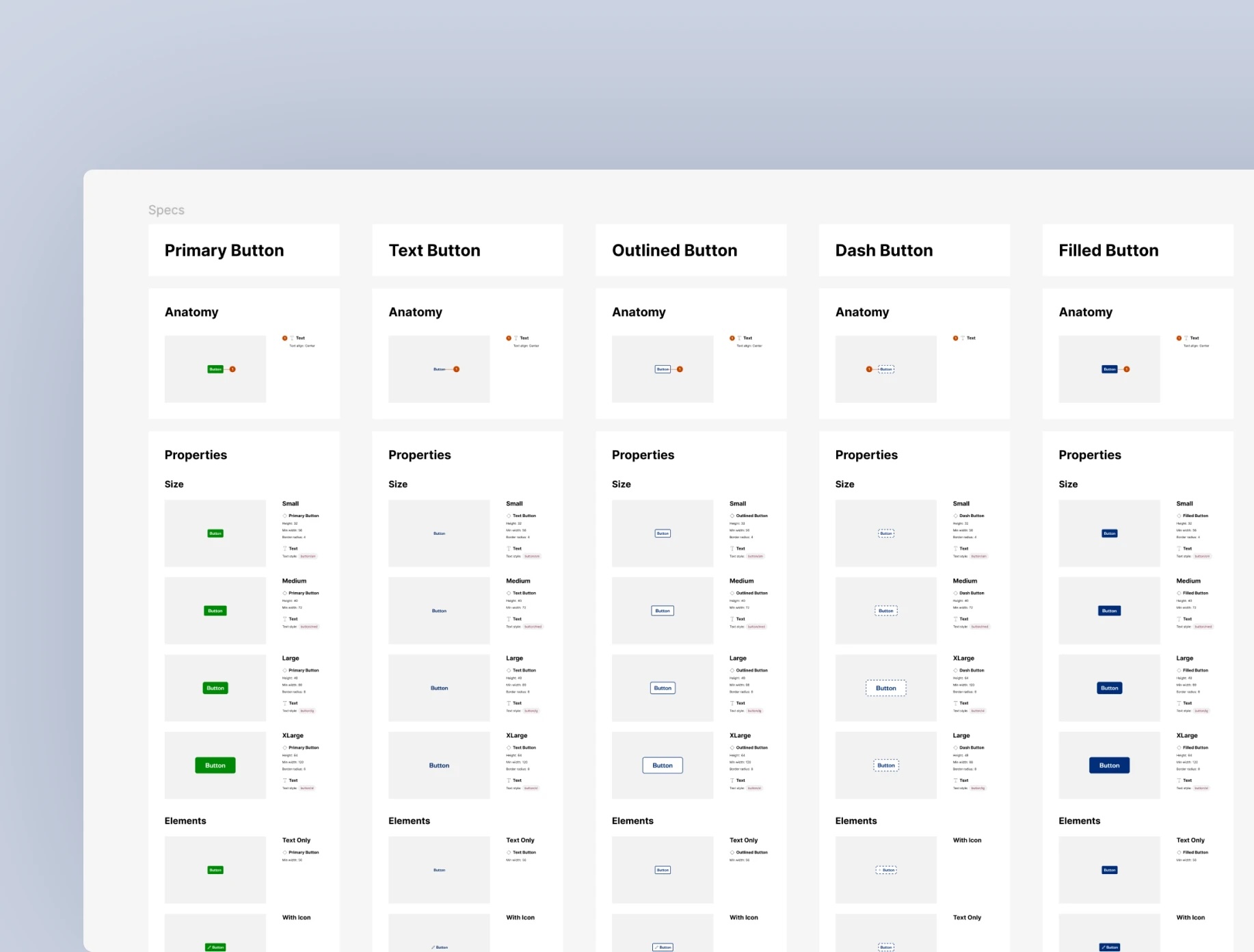
- Components: UI elements from buttons to full pages.
- Patterns: Workflow guidelines like navigation and feedback.
Building the components
We structured our work in phases: first, importing and refining existing components; then building missing ones; and finally identifying system-wide improvements. Throughout, we focused on consistent naming, accessibility, clear documentation, and close collaboration with engineering and stakeholders.
Outcome
Our work established a solid foundation for future enhancements, allowing us to take a more strategic and scalable approach.
This baseline guided our decisions and ensured that improvements were implemented systematically across the product. By creating a cohesive framework aligned with our long-term goals, we set the stage for ongoing progress and a significantly improved user experience.